
Designing an energy management dashboard to track and optimize EV fleet operations
Overview
Ampcontrol is an AI-powered charging management software helping companies like Revel optimize EV charging and telematics. As the second designer, I collaborated with a TPM and engineers to launch a new landing page, enhancing operational visibility for managers and strengthening Ampcontrol's competitive edge.
Timeline
Teammates
Contributions
5 weeks
Product & Engineering
B2B Dashboard Design, UX Research & Strategy
Impact
33%
15%
30%
Reduction in charging downtime through improved visibility.
Faster hardware issue resolution for ground operators.
Increase in customer acqusition
How might we improve visibility for operators to monitor sites, resolve issues faster, and ensure seamless EV charging?
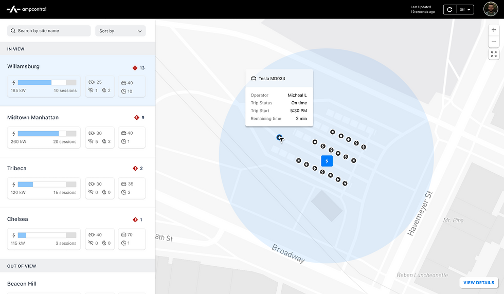
Overview of Assets
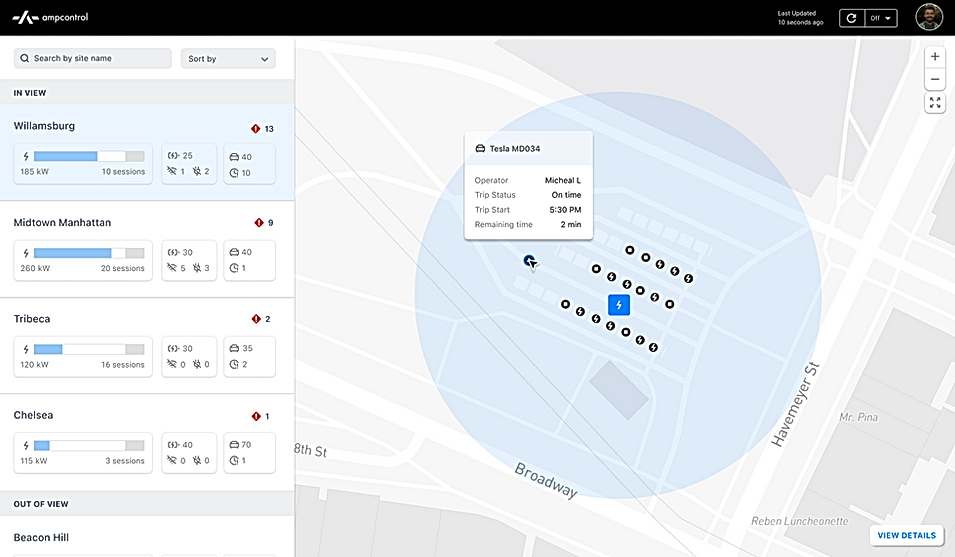
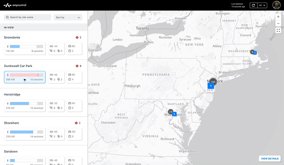
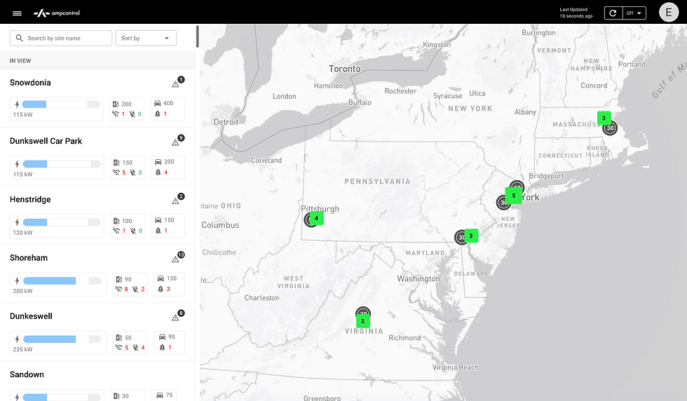
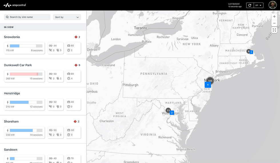
A map view providing a global overview of an organization's charging networks with zooming/panning capability, alongside a detailed list view showcasing information including the power utilization, asset counts, hardware issues and more for each network.
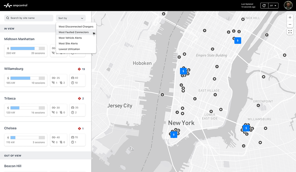
Sorting Capability
The ability to sort by issues and alerts relevant to ground operators.
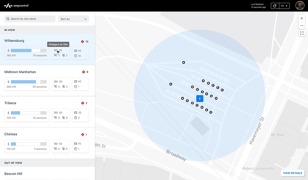
Info & Asset Tags
To simplify complex data presentation, I utilized icons for clear visual communication and integrated tags in hover and select states for added context. Tags were implemented in the list view and map pop-up modals to provide quick access to vehicle and charger details.
Initial Problem
Problem
EV operators could monitor individual site activity but lacked visibility into of charging sessions and operational issues across all locations.
My Goal
Redesign the landing page serves as the single source of truth for ground operators, enabling them to oversee operations and manage issues across entire organizations.

Screenshot of Ampcontrol's original dashboard
Research Insights
User Needs
Operators need real-time visibility into all their charging sites to manage energy consumption and avoid costly overages.
Operators need to quickly identify and resolve hardware issues to minimize downtime.

Business Goals
Clients wanted a comprehensive asset overview of vehicles and charger to predict charging trends, optimize operations, and scale efficiently.
Ampcontrol recognized these additions would help them stay competitive in a fast-evolving industry.

Competitive Evaluation
All key competitors used dashboards to present organization-wide fleet data. I conducted a competitive analysis focused on how they effectively conveyed complex energy data concisely and identified key strengths in their approaches.

Prioritizing what to build
I leveraged our research to identify features that best addressed user needs while aligning with the team's bandwidth and resources. My PM and I prioritized high-value features within our timeline, including those highlighted in blue.

Design Explorations
A key design challenge while ideating was selecting the most critical KPIs to help operators quickly assess site performance while balancing screen real estate between the map overview and list view- showcasing valuable insights without overwhelming users.
01
Balancing Screen Real Estate
Users noted that the list view consumed too much screen space, limiting the map's visibility on their assets (vehicles & chargers).
Redundant KPI's
Using different graphs (bar vs. pie) for visual diversity led to overlapping metrics (e.g., total available power vs. site utilization), which diluted the impact of our data.

02
Maximizing visibility of sites
This list view still consumed too much space, reducing the number of visible sites at a glance and requiring a lot of scrolling.
Iterative KPI Refinement
This version lost key details; operator feedback showed that metrics like faulted connectors and trip delays were essential, prompting further refinement.

03
Table Format
While it allowed us to present more data, testing showed it wasn't scalable and required extra focused reading.
Color Coding Map Assets
Experimenting with color-coded differentiation proved overwhelming, as users struggled to establish a clear visual hierarchy.

04
Tabbing Format
Separating charger and vehicle data improved organization, but users found it frustrating not having everything visible on one screen.

05
Hover Interactions
Strategically revealing details on hover prevented information overload and received positive user feedback.

Design Constraints
I joined Ampcontrol when they were using Material UI for its ease of implementation. Given its design constraints, I focused on refining design tokens and components to improve quality while keeping things seamless for engineering. This came through in the final designs by enhancing color, typography, and details like cards, icons, and dropdowns for a more polished, branded experience.
Updates

V1
V2
Applying this to pages
V1
V2
Reflections
This was a high-impact project I took on early at Ampcontrol, where I learned to collaborate cross-functionally, advocate for design quality, and rapidly iterate, test, and ship.
With more time, I would have explored deprioritized features like long-term charger health analytics, fleet-wide insights, trip feedback, accident prevention, route previews, and proactive tools like charging queues and scheduled maintenance reminders.
I also would have started tracking additional success metrics like dashboard usage frequency, on-time trip departure rate, issue detection and resolution time, and fleet and asset growth rate to further evaluate long term success.
design by Mita Elan © 2025