Apple Project Spaces
Increasing visibility and collaboration during project development for teams at Apple
Overview
"Project Space" is a collaborative dashboard designed to streamline project lifecycle management, aligning teams and stakeholders at each project phase. It offers customizable templates, phase-specific data visualizations, secure sharing, and reporting tools, creating an adaptable and organized workspace for scoping, implementation, testing, and more.
Timeline
Teammates
Contributions
2021
Product & Engineering
UX Research, Product Design (B2B/SaaS)
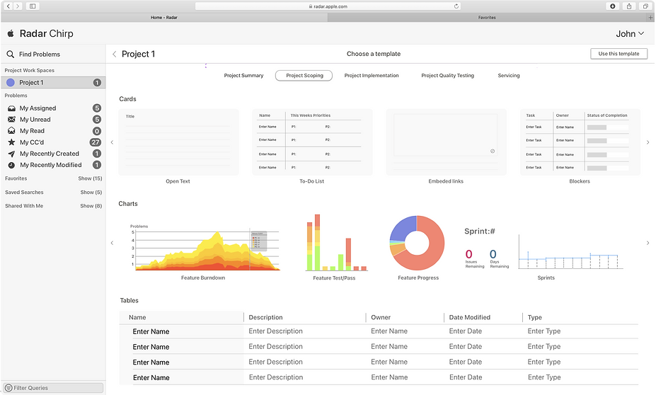
Creating a Project
Project Tracking Templates organize and visualize key data at each project phase—scoping, implementation, testing—to keep teams aligned and progress transparent

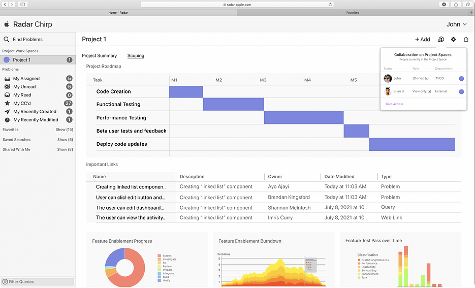
Project Spaces
Individual Project Spaces provides a personalized workspace to track, document, and manage every phase of a project, with customizable views and secure sharing options.


Archiving and Templates
Enabling project spaces to be archived and reused as templates, streamlining future project setup

What was the impact?
Design Impact
3 design concepts handed off
65,000+ employee workflows improved
Research Contributions
10 interviews and workshops conducted
6 usability tests conducted
3 artifacts handed off

What was the initial problem?
At Apple, I was tasked with enhancing Radar, an internal issue-tracking system that unites teams by tracking and reporting bugs. Radar lacked a true concept of a project, so employees often had to resort to 3rd party tools, leading to a disconnected and expensive workflow.
My goal was to transform Radar into a “one-stop shop” for project management, enabling managers and teams to track the health of their projects and loop in adjacent teams and stakeholders.
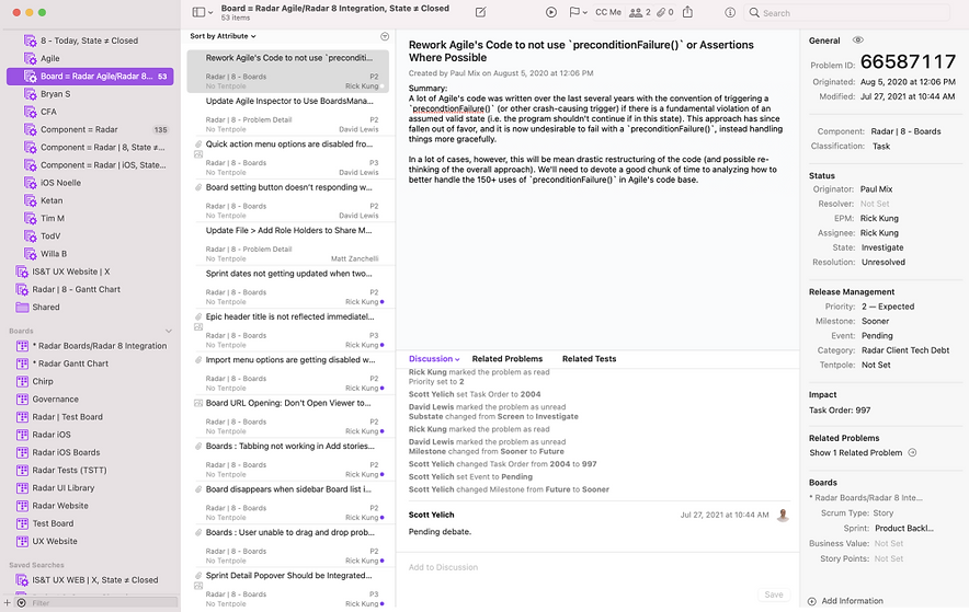
Screenshot of Radar's original dashboard
What did I learn through research?
I first conducted a series of 10 in depth User Research Interviews with avid users of Radar which included seasoned TPM's and Engineers at Apple to understand the main gaps within Radar. These interviews led me discover several important findings.

01.
Too many touch points - Too many tools for employees when tracking efforts across teams. Managers wanted their work to be closer to Radar
02.
Lack of Visibility across teams There was a lack of visibility around who is responsible for a task when tracking projects, which was important when managing resource capacity and tracking deadlines
03.
Lack of flexibility with charting data When tracking various efforts of a project, managers tend to use several types of data to understand all the moving pieces. At the time, there was no tool that could “house” all the different pieces of a project
How might we help Product Managers better track projects within Radar by creating a more connected and organized workflow
How did I start designing a solution?
In the early brainstorming phase for Project Spaces, my team and I conducted a participatory design activity to refine our direction and validate concepts quickly. We used a basic project space skeleton in Numbers, allowing participants to customize sample cards and discuss the project management features they needed most. These were the outcome of the sessions:

Teams wanted:
01.
The ability to see specific data depending on the phase of the project
02.
The ability to have the flexibility to configure/format the dashboard
03.
The ability to share elements of the Project Spaces with stakeholders
04.
The ability manage access and disclosure easily
Solution 1
Iterations
01.
Users found the current menu confusing and wanted clear separation between bug tracking vs projects.
02.
Pushed data visualizations to higher fidelity.
03.
Added a search functionality when sorting through cards.
Next Steps?
I initially joined Apple as a UX research intern for the Radar team, so I spent most of my time becoming a subject matter expert on project development at Apple and Radar's gaps. I ended up only spending around 2 weeks designing and iterating my final solution, so if I had more time, I would have:
01.
Collaborated more with the design team to standardize many of the visualizations that I designed to ensure consistency with their internal design system.
02.
Added the ability to drop in links/info/data directly from 3rd party tools onto the dashboard with ease for a more connected workflow.
03.
Added notifications when reports were being shared, new changes were being made, for more visibility.
04.
Explored how to translate designs for iPad and a mobile as well.
design by Mita Elan © 2024